Rodrigo Corral Studio
2021-present
Role
I work as a freelance 3D artist and visual designer with Rodrigo Corral Studio, contributing to the visual direction across book covers, marketing campaigns, and pitch work. In collaboration with the team, I help translate early concepts into fully realized visual systems, developing 3D imagery, motion, and exploratory frameworks that extend beyond a single deliverable.
My role focuses on shaping how ideas take form, bridging concept and execution to create cohesive, narrative driven visuals for authors and campaigns. The work often sits at the intersection of design and experimentation, pushing beyond traditional publishing aesthetics into more art led, forward-looking territory.
Programs used: Cinema 4D, Redshift, After effects, Adobe Suite
01 / Read Write Own
https://a16zcrypto.com/readwriteown/
Brief
Develop a flexible motion identity for Read Write Own that could bring the book’s visual language to life across physical installations, large scale media and digital campaign touch points. The system needed to translate seamlessly across an Infinite Objects collaboration, Times Square billboards, social content, web and launch materials.
Contribution
I led the development of the motion design system, translating the book’s graphic identity into a modular language of movement, pacing and dimensional transformation. I established animation principles that could scale across dramatically different formats from intimate physical displays to monumental outdoor screens while maintaining a recognizable visual identity throughout the campaign.
Challenge
The primary challenge was designing one system for dramatically different scales and viewing conditions from a collectible physical display to monumental Times Square screens and mobile social placements. Each application required different compositions, pacing and levels of detail without losing the central visual language.
Outcome
The resulting animations became a central part of the book launch, appearing across Times Square and throughout New York City, as well as on web, social and the Infinite Objects release. The system gave the campaign a cohesive presence across physical and digital environments while extending the book beyond its printed cover.
Brief
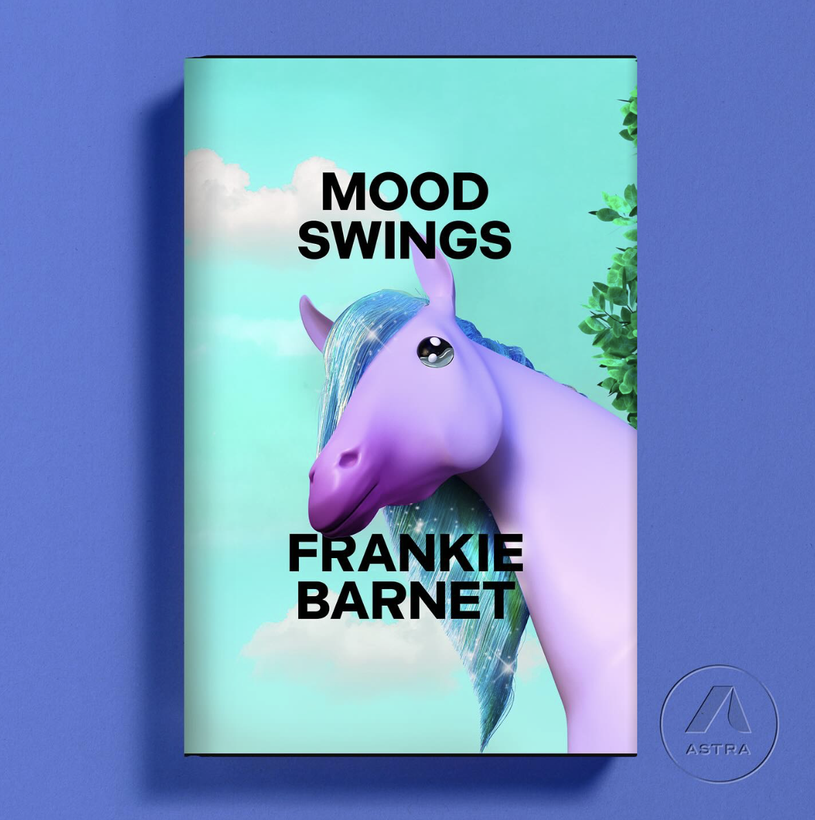
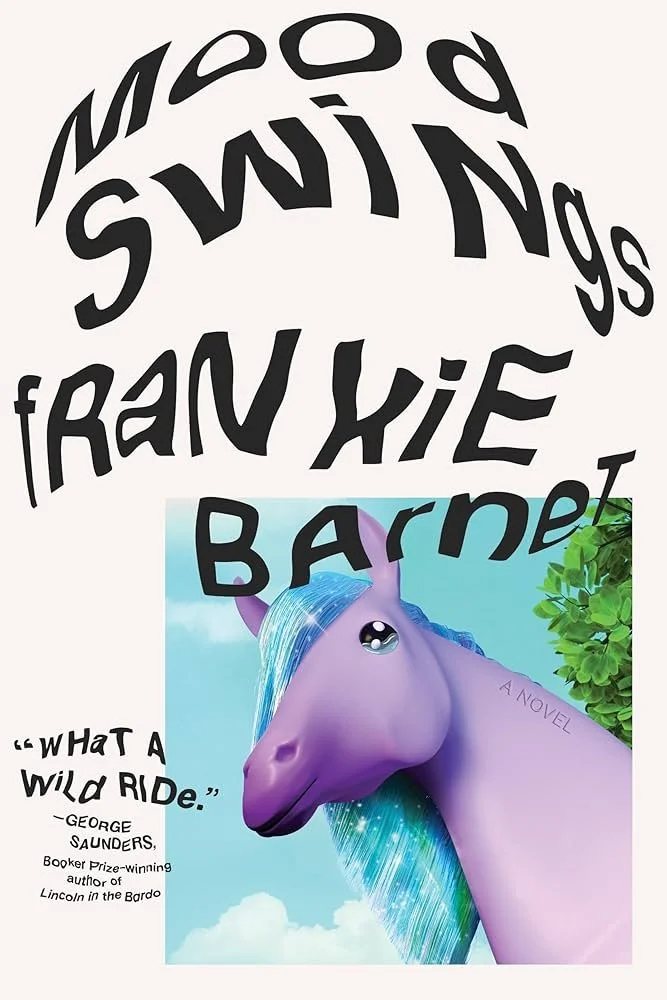
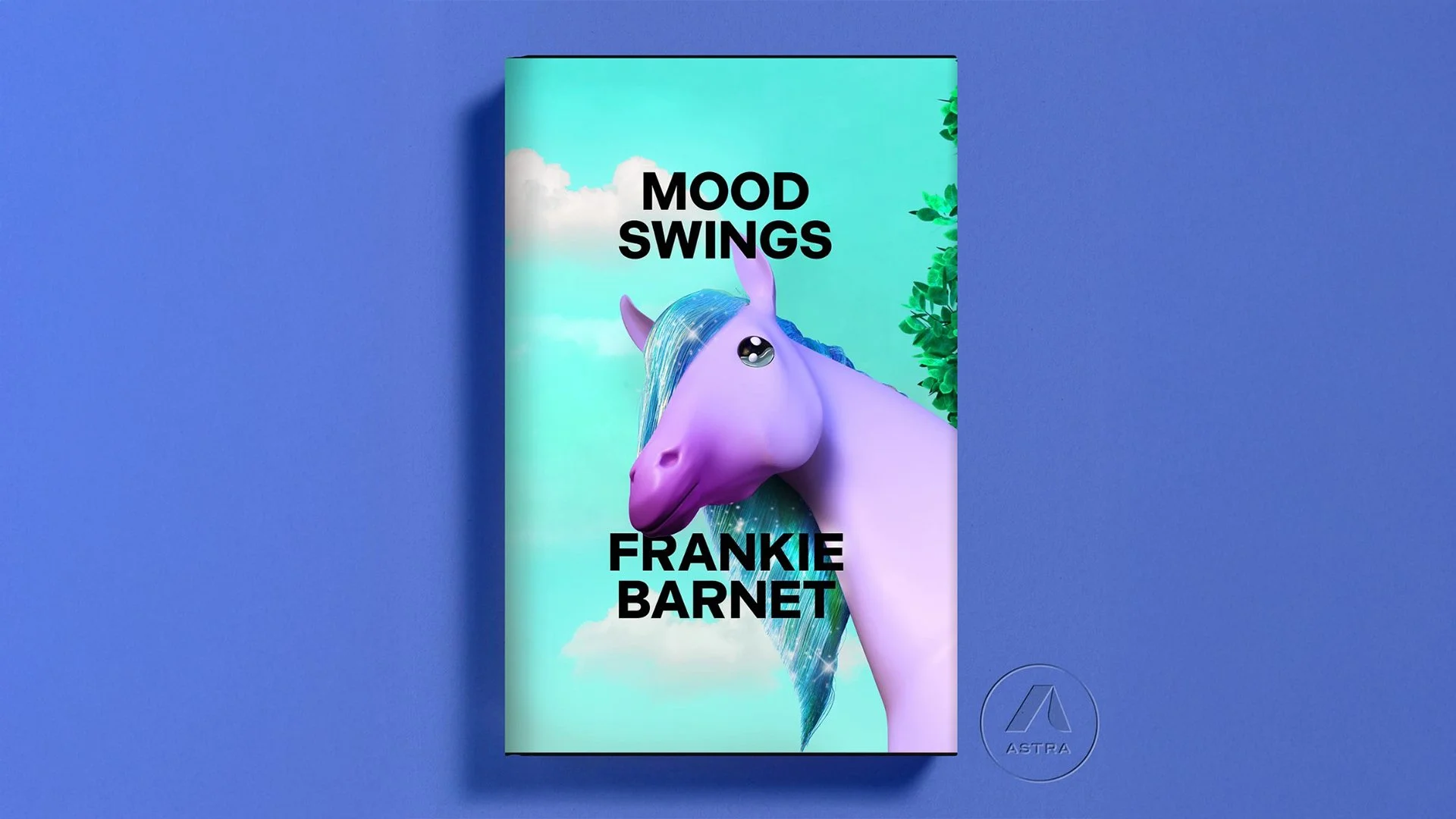
Create a distinctive cover for Mood Swings that could translate the book’s emotional shifts and unpredictability into a single conceptual image, then extend that visual language into motion for its wider marketing campaign.
Contribution
I developed the cover concept and produced the final 3D artwork in Cinema 4D, directing the composition, lighting, materials and overall visual treatment. This became my first published book cover. I then expanded the static artwork through motion design in After Effects, establishing how the cover could transform across promotional content.
Challenge
The challenge was condensing an emotionally layered subject into one clear visual metaphor that felt unexpected but remained effective as a published cover. The concept needed to hold its impact at both thumbnail and physical scale while also containing enough visual depth to evolve naturally into motion.
Outcome
The final artwork became the published cover of Mood Swings and established the foundation for its animated marketing materials. Extending the concept into motion created a consistent identity across the physical book and its digital launch campaign.
03 / Stranger to Ourselves
https://www.instagram.com/reels/CjBI-dkpl7T/
Brief
Develop a motion led promotional system for Stranger to Ourselves that could interpret the book’s psychological themes and transform its typography into an expressive part of the campaign.
Contribution
I led the motion concept and animation development, treating the typography as a shifting psychological form. Words stretch, deteriorate and fragment over time, visualizing the instability between how we understand ourselves and what may exist beneath that perception.
Challenge
The challenge was communicating an internal, psychological premise without relying on literal imagery or exposition. The typography needed to be pushed far enough to evoke instability, fragmentation and decay while remaining recognizable and connected to the original cover identity.
Outcome
The resulting motion work expanded the book’s visual identity into a narrative campaign language for marketing and social content. Rather than simply animating the cover, the system used typography to communicate the underlying premise of the book and create a more emotionally charged digital presence.
04 / Renders and Concepts